"Art washes away from the Soul the dust of Everyday Life" -Pablo Picasso
Thursday, June 26, 2008
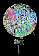
"A Negative Impression..."
...Of A Fanciful Floral Mandala...
Flipped ... Over to the "Dark Side."
Hmmm...How colorfully wicked!:)
12 comments:
Anonymous
said...
Margaret, This is absolutely gorgeous! I looked at your tags expecting to see pastels - how DID you get such clear colors on a black background? And such clear white detail lines?
Effective to the extreme (that's extremely effective flipped over to the bright side!) I like it very much how do you do it?? inquiring minds want to know
BAM !!! Quite striking and beautiful.....I love that this piece is symmetrical and asymmetrical in the form of the flower at the same time.....looked at it for a long time. You should be proud....
Oooh my! What wonderful thoughts and comments...I thank each of you so very much...it is a thrill to view my artwork through the eyes of others...I am tickled you enjoyed it so! It was a treat for me to design! :)
 ...Of A Fanciful Floral Mandala...


 "Cactus Monday"
12 comments:
Margaret,
This is absolutely gorgeous! I looked at your tags expecting to see pastels - how DID you get such clear colors on a black background? And such clear white detail lines?
colours are just mindblowing!!!
beautiful:)
Effective to the extreme (that's extremely effective flipped over to the bright side!) I like it very much how do you do it?? inquiring minds want to know
BAM !!! Quite striking and beautiful.....I love that this piece is symmetrical and asymmetrical in the form of the flower at the same time.....looked at it for a long time. You should be proud....
A "negative impression", but there's positive JOY in this one! LOVE it!
Wow oh wow! This is GLORIOUS. Such deep, vibrant color and the design is STUNNING! I am not usually drawn to mandalas, but this one's "got me!"
These are Gorgeous, and so very creative!
Wow. It's so beautiful.
BEAUTOUS!! Great fresh colors and shading. Kind of reminds me of a bridal bouquet. At night :)
Ooooh...I love its iridescence!
Oooh my! What wonderful thoughts and comments...I thank each of you so very much...it is a thrill to view my artwork through the eyes of others...I am tickled you enjoyed it so! It was a treat for me to design! :)
This is beautiful. Nothing like black to make colors pop. Do more please! Do more! :)
Post a Comment